
WordPress is an easy-to-use and open-source content management system (CMS). It powers millions of websites worldwide. People prefer using it because it’s feature-rich. Plus, there’s an arsenal of must-know WordPress tips and tricks at your fingertips.
But let’s put things into perspective. If WordPress is such an easy-to-use and great CMS, you must wonder why WordPress users still make mistakes.
Well, the unfortunate part has to do with being human. People tend to make mistakes. Fortunately, they step up to correct these mistakes — resolutions we’ll discuss in this article.
Here, we’ll go over the most common WordPress web design mistakes. This way, you can avoid them and design highly functional WordPress websites.
Non-Existent Navigation Bar
When people visit websites, one of the first things they look for is the navigation bar, or ‘nav’ bar. Whether they’re checking out personal blogs, an accountant website, or marketing portfolios, they need a system that enables them to jump from one page to another.
Think of your nav bar like any above-the-fold content. Because it’s one of your website’s make-or-break elements, you need to design it for performance and functionality.
Here’s a list of the best practices for designing your navigation bar:
- Use descriptive links to core sections – Include links to About, Contact, and Blog pages for easy access. Also, use keywords to optimize these pages because they reveal essential details about your brand, how to reach you, and your style of disseminating information.
- Provide a visual sitemap – Navigate people to pages of their liking. If they have an idea of their destination, why not feature a page on your nav bar that contains a one-click solution?
- Include a call to action – Drive visitors to your main call to action (CTA). It informs them of your website’s goal from the moment they land. If you don’t have a specific CTA, you can use a multichannel chat widget on our blog posts, for instance, so readers can ask questions about your articles.
Poor Colour Scheme
If visitors have a challenging time reading the text on your website, the odds are that they’ll search Google for a similar website and head there. You can expect the same if your website design features a colour scheme that is painful to the eyes.
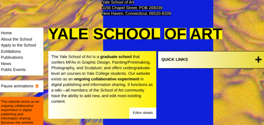
An example is the website of Yale’s School of Art. It features uncoordinated colour choices. It also lacks professionalism and excludes branding.
Here are ways of choosing the best colours for your website:
- Refer to colour psychology and theory – Brush up on colour associations and the basics of how colour works — and about primary, secondary, and tertiary colours. These matters are instinctual and can evoke subconscious emotions.
- Use contrasting colours – Create impact with contrasting or complementary colours. It allows you to emphasize a point on a web page.
- Integrate branding – Choose colours that play well with your branding. Use your existing colour options. You can also modify your branding’s colour to produce a likable effect.
Not Observing Golden Ratio Typography
Golden Ratio Typography (GRT) is a basis for typesetting. It can help determine the ideal font, font size, and content width for your website.
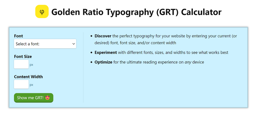
GRT-enhanced texts are easy-to-read and enticing. They also use the power of persuasion — and encourage visitors to pay better attention and find you more relatable.
Here are tips on maximizing the golden ratio:
- Create spacing guides – Define content gutters or spaces between columns. Separating your content well helps people understand better.
- Design base website grids – Determine the best browser and screen resolutions. Then, use GRT to know how much content you can fit for the devices of your target audiences.
- Harmonize elements – Produce powerful visual appeal for logos, site icons, and other visuals that are often part of your branding. Featuring harmonious elements builds credibility and adds professionalism.
Using A Bloated Theme
Free WordPress themes are great because you don’t have to pay for them. The catch? They feature unoptimized code that drags down website speed.
We live in a fast-paced world. Here, people dislike slow things. If your website is slow, you need to speed it up. If not, you’ll face a loss of traffic, a catastrophic decline in search rankings, and increased bounce rates.
Here are measures you can take to prevent the use of bloated themes:
- Choose free themes that aren’t bloated – Select the Elementor Hello Theme or Qi Theme. Not only are they free, but they’re also performance-focused.
- Use premium themes – Install Astra, GeneratePress, and other highly praised premium themes for high performance. Then, you can pick from your choice of WordPress plugins to download and activate to continue running at optimal performance. Because they only contain bare-minimum features, they give you complete control over your website.
- Simplify design and disable bloat – Look to minimalism. Then, remove unnecessary website features, plugins, and scripts.
Unoptimized Page Experience
While important, speed is but one factor. For a fast-loading and efficient SEO-friendly website, be mindful of the Google Page Experience Update, too — meant to offer a better experience and high-quality page performance.
In light of the Update, increasing your Core Web Vitals score will improve the user experience (UX) and user interface (UI). Your website will also benefit from higher organic rankings and increased conversion rates.
Here are ways you can improve your Core Web Vitals score:
- Compress and optimize images – Address the Largest Contextual Paint metric and reduce the sizes of images with TinyImage, Kraken.io, or other compression tools. Also, use a Content Delivery Network to serve images from the nearest server location.
- Prioritize above-the-fold loading – Work on the First Input Delay metric and look into the critical sections of your design. If you see any issues, resolve them.
- Optimize CLS and specify image location – Fix images, ads, and embeds without dimension and ensure proper width and height attribution. Not only will it optimize your Cumulative Layout Shift, but it will also stabilize loading.
Conclusion
Making web design mistakes on your WordPress website isn’t the end for you. If you rectify your blunders quickly, the situation will improve.
Do your best to avoid making mistakes, though. While there’s a sea of WordPress tutorials that can help you correct your course, your mistakes are detrimental to your success. They can still adversely affect how your brand connects with customers — and vice versa.
An actionable step is to prioritize regular website checkups. Conduct a website audit to identify problems with functionality and performance. And to ensure your website isn’t outdated, perform these checks every six months.


