Use specific design components to elicit emotional responses
Strong emotional connections stem from being able to relate to a particular subject. This same principle is useful for making emotional connections with users on websites. To create a more personalised user experience, web designers use specific design components to elicit emotional responses. While essential and useful, this design aspect must be developed with a particular brand and the target audience in mind. Imagery, colours, and tone of voice are the parts typically associated with emotional web design.
Whether you work on a web design agency’s team or are a solo web designer, you should understand your customer and their target audience. To do the latter, you must have at least a few discussions with your client to find out details about their business and average clientele. Researching this on your own is essential as well, but a simple client meeting will help you to kickstart the whole process.
Digital and design agencies in San Francisco are continually looking for new and more effective ways to deliver brand messages to target audiences. Every business has a unique voice, message, and audience. So if you want to come up with the best designs, then you need to understand these components – they are the basis of your future projects. Emotional design helps tie the target audience to the brand by addressing its needs and wants.
Choosing the Right Imagery
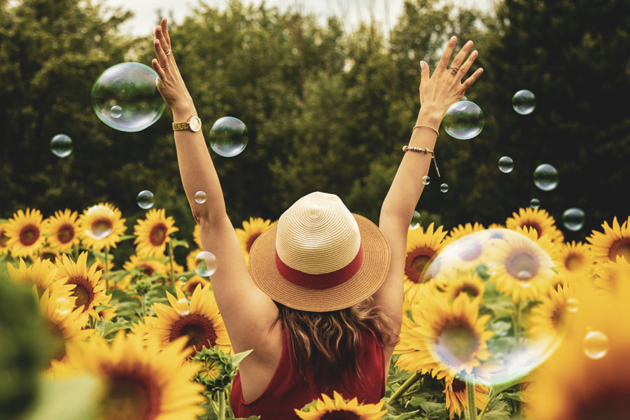
During an initial glance, users will quickly decide if a website is visually appealing. Sites with large photo banners can quickly engage users. To ensure that this first encounter is positive, brands need to use images that relate to their users. Studies show that people feel more empathetic during face-to-face interactions. This applies to photos as well. Users are drawn to faces and connect more when they recognise themselves within a picture, thereby creating an emotional connection.
Let’s say you’re designing a site for a company that directly deals with people. It’s essential to use large photo banners with people who emulate their users. It is especially necessary for the articles since you want the end-user to value and trust the information they’re seeing. Showcasing relatable photos allows you to grasp the user’s empathy and help the brand connect with them. The imagery is a means to show that the company understands, cares, and is there to help.
Choosing the Right Colours
Colours play into emotions psychologically. They play an essential role in setting the tone for a website. Picking appropriate colours for a website can help elicit desired responses from users. For instance, red and yellow can make users feel anxious or in a hurry, so they are not suitable colours for a site whose goal is to draw users to read the content. Blues and greens seem to be a safe bet when appealing to users globally, but even shades of these colours carry specific notions. For example, light and dark blue are considered calming, but dark blue is also an excellent color to showcase strength and security. Keeping in mind the specific emotional connections users have with colours will help you design a site that better connects with your target users.
To help you find your foundation of colours for your web design projects, you should consider these associations users have when they see particular colours:
Red: anger, danger, love, danger, war. A darker red could be associated with elegance;
- Orange: autumn, energy, vitality;
- Yellow: cowardice, happiness, warning, or wealth if used in a golden shade;
- Pink: femininity, romance, and sensitivity. May also convey innovation and energy;
- Purple: creativity, luxury, royalty, spirituality;
- Blue: calmness, corporate, reliability, sadness, trust;
- Green: cleanliness, luck, nature, (depending on the shade used);
- Grey: conservative, luxury, modernity;
- Black: elegance, power, strength;
- White: cleanliness, grace, innocence, purity.
Choosing the Right Tone of Voice
Words deliver messages, but tone dictates how that message is received. The wording of a title or header can form the personality of a website. What tone of voice should a brand’s website communicate to users? Should it be professional, empathetic, comedic? The answer should always relate to the reason users are visiting the site in the first place.
A Few Additional Tips
Design is not just about making things beautiful, but rather about how things make us feel, influence us and our experiences. Emotions affect us before our rational and cognitive processes kick in. Before we start thinking, we already have an image in our minds.
Getting a Better Understanding of the User
Focus on the audience. Understanding who is going to see your product will define the color, typography, and type of content used for its marketing.
Sharpen the Message
The content you use to advertise your product should be able to connect to your user. Adding some humor might help or words like fun and easy. The content you use should match your company’s image.
Select and Create the Right Images
Images also elicit emotions by what they display. Whatever meaning your image has, it should be evident from the context. Do not force your viewer to guess why an image is present.
Adding Video and Audio
These two subtle elements work together to convey something simple but create an unforgettable message that users connect with their experiences or feelings. They develop emotions.
Conclusion
Your main goal is to make a connection between the user and the website. When considering images, colors, and tone of voice on a website, you should always center the user, your particular client, and their target audience – they are the key to making effective decisions. By understanding them, you’ll know what you should emphasize and what emotions you have to evoke.