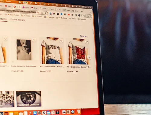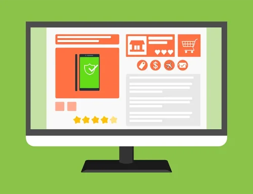
Product pages are an ecommerce website’s most valuable asset. After all, they are ultimately the ones that convert your customers. No matter how well the rest of the website has been designed, if the product pages are not good enough, you risk losing revenue.
Product page design, product descriptions, and all the other copy you place on them thus need to align with both your brand’s voice and values, address your audience’s pain points, and use relatable language.
Here are seven great product pages to help you discover how to achieve just that.
Feature Images and Video
First and foremost, your product pages need to have just the right amount of images and, ideally, videos. They serve to showcase your product from different angles and being used in different scenarios. They will help your customers visualize themselves using it and understand what to expect.
How many visual elements you actually need will depend on the nature of the product. For example, clothing items will benefit from a “the more, the merrier” approach. Customers will want to see the item close up and from various angles, ideally also in motion.
Other items need fewer photos. Take a look at the Get Safe medical alert systems page. It shows the various items that come with the system, but only from one angle. It also features a great video that shows the product in use, from all angles, letting customers gauge the size and how it would fit into their own home.

Make It Information-Heavy
Some products also need to be accompanied by a lot of information in order for a customer to feel more comfortable making a purchasing decision. This is especially true for products that come in different dimensions and colors or products that can be used for various purposes.
Think of it this way. The less often a product is purchased, the more information you need to provide for it. The more valuable the product is to your customer, the more information it needs to come with.
For example, a mug does not need to be described at length. But a toothbrush does, even though it’s also a small item that is regularly replaced — its quality is of high importance to its user.
Take a look at this product page from Dress Forms USA. It gives a ton of information about the product itself, and it also features a detailed measurement chart that will help dressmakers choose exactly the size they need.

Since this is a product they ideally only rarely want to buy, all of this information will help them make their decision more easily.
Use Minimalistic Descriptions
You can also take the exact opposite route when describing products (provided that they don’t need to be described at length).
Let’s look at a page from Glossier straight away to illustrate that point. They give you no more than 100 words about the item. This is, however, enough to tell you what the product is, how it feels, and why it’s great.

They let the product reviews below do more of the talking, as they have understood that customers don’t need to read a 500-word essay about the benefits of a lip product. A lot of brands, in an aim to rank higher, will add unnecessary content to their product descriptions. This makes them more difficult to digest and much more clunky.
Provide Further Recommendations
One of your ultimate goals is to increase the value of each shopping cart. Alternatively, you want your customers to find the item they are looking for even if they haven’t clicked on it themselves yet.
This is why adding product recommendations to your product pages is crucial. They will introduce more of your stock to your customers and help them discover items they would otherwise have completely missed.
Farfetch does a good job. For one, they feature a “complete the look” section, which recommends items to go with the one you’re currently viewing. They also recommend similar products from the same category, in case you’ve missed them.

When adding this element to your product pages, make sure the recommendation make sense. Don’t show products randomly just because they fall into the same type of product. If your customer is looking at short-sleeved polo shirts, give them more of that.
Add a FAQ Section
Adding a FAQ section to your product pages is another great way to boost their value. It will save your customers time and effort, as they will no longer need to browse the rest of your website to get this information. Plus, it gives you a chance to overcome some of the most common conversion obstacles.
When composing your FAQs, make sure they are not the generic questions most brands will feature. Take a look at your customer service inquiries and brainstorm what it is that most customers might want to know about the product. How is it unusual or different, and what information might help them buy it?
Thankbox does a great job with their online group leaving cards page. They’ve struck a nice balance between questions about their service and the product itself and the question that most people will ask: what should I write on a card?

Take an Interactive Approach
Interactive product pages let you boost engagement and conversion rates, as they are instantly more useful than regular product pages. Depending on the nature of the product, they can include calculators, maps, or AR elements.
We’ll be looking at this jeans fit guide that shows customers what different models of jeans look like and compares their key elements. This makes shopping for jeans infinitely easier, as you no longer have to guess what a model will look like in person.
Note that this approach won’t work for all brands, so don’t worry if you don’t have an interactive product page idea.
Don’t Create a Product Page
Finally, here’s a controversial thought: don’t create a product page. It might sound counterintuitive, but if you are selling just one product, it makes perfect sense.
Rather than asking your customers to jump from one page to another, you can provide all of your most valuable information, including product details and “add to cart” CTAs, on the homepage.
A one-pager will work, but you can also feature a couple of other pages, like the “about” and “contact” ones search engines love to see.
Kopi Luwak Direct created a great website based on this principle. As you scroll down the page, you get more and more information about the product, and you can jump directly to the shop section.

Since all you have to choose is how much coffee you want to buy, creating a separate page was superfluous. They’re not wasting any link equity this way, and they’re able to rank the page for more keywords.
Wrapping Up
Before you start (re)writing your own product pages, carefully analyze what is currently good about them and which elements could be improved further. Chances are, you don’t need to start from scratch, and parts of what you already have in place will work very well.