
As an e-commerce business owner, your store and your customers mean everything to you. But when you lose loyal customers or warm leads due to a poor user experience (UX), you know something’s got to change.
That’s where this helpful guide comes in.
Today we’re showing you how to design a user-friendly and responsive website for your niche market in six simple steps.
We’ll also show you examples of websites that are putting these insights into action. Finally, we’ll share an additional five bonus tips to help you deliver an even better UX.
6 steps to designing a user-friendly and responsive website for your niche market
Here’s how to get serious about UX and responsive website design:
1. Understand your target market
Start by getting clear on your niche market. What are their specific problems? How can you help solve them better than the competition?
Write three to five lines that answer the above questions as concisely as possible, such as “We’re the only e-commerce brand that promises a lifetime warranty on polarized sunglasses”.
Save these lines of copy to include throughout your website where appropriate, such as on product pages, in CTAs, and on your About page.
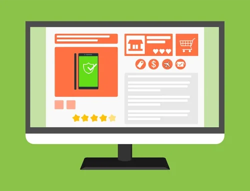
2. Apply responsive web design principles
A responsive website design may sound fancy, but the principles are pretty simple.
Here’s the gist: You need to make sure your site looks amazing, runs fast, and functions optimally on a wide range of devices and screens.
That means:
- Always start with a mobile-first design
- Make sure your image sizes match the screen sizes they’re displayed on — these are called “responsive images”
- Make sure your text, menu options, button design, and web page sizes match the screens they’re viewed on
3. Keep it simple and engaging
A user-friendly site marries the beauty of design with the simplicity of minimalism. In other words, you don’t have to choose basic styles when analyzing templates or custom design options. But you do need to make sure you include plenty of white space and layout elements that aren’t overwhelming to the human eye.
For instance, including bold typography can captivate your audience when paired with a modern layout and minimalist images. But including bold text and bold images without negative space could overwhelm users, contributing to high bounce rates.
4. Keep it user-friendly with intuitive navigation
Create a consistent user experience by making sure your site feels intuitive to both desktop users and mobile users.
Test your navigation on a wide range of devices and consider getting a focus group to share feedback, too. You can also use heat maps to discover if any part of your site contributes to rage-clicking or bounce rates.
5. Create calls-to-action (CTAs)
Align your sales goals with your target market’s pain points to create clear CTAs. Include these CTAs throughout your site where appropriate.
For instance, “Struggling with work productivity? Sign up for our free productivity webinar”. Or “Need help with productivity? Check out our latest productivity journals and get 10% off your first order!”.
Pro-Tip: Include target keywords in your CTAs to boost SEO potential.
6. Conduct a responsive test
Conduct a responsive test to see how your site measures up.
An adaptive design should function optimally during portrait orientation, landscape orientation, and on a variety of desktop and mobile devices. If you’re not getting these results, it’s time to course-correct or reach out to a pro for support.
Putting it in action: An example of a user-friendly and responsive website in a niche market
Let’s examine a responsive site that’s applied all six principles we covered above.
A prime example is YUPLAY, a successful platform that specializes in selling online PC games.

Here’s how YUPLAY’s site stacks up:
Understanding the audience
YUPLAY caters to a specific audience: Gamers. Therefore, the website is designed to meet their unique needs.
For instance, its target audience pours a lot of time and money into a video game called Fortnite. Its audience also loves spending money on additional Fortnite features and products, such as Fortnite Spiderman skins and other digital outfits. As such, YUPLAY aligns its design and offerings accordingly.
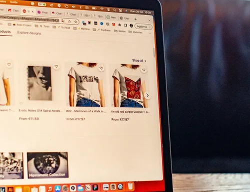
Check out its Fortnite Spiderman product page to see what we mean:

Responsive design
The era of the mobile-first approach is here. YUPLAY provides a seamless experience regardless of the device users are on. It ensures its platform is accessible and functional both on desktop and mobile, providing a flexible design that adjusts to different screen sizes.
Simplicity is key
When you visit YUPLAY, it’s all about the games. A clean, minimalist design allows users to focus on what’s important — finding and buying their favorite games and accessories. Reducing clutter and focusing on essential elements can greatly enhance the user experience.
Intuitive navigation
YUPLAY uses intuitive navigation, ensuring users can find what they’re looking for with ease. A visible search bar, well-categorized games, and easy-to-find information make browsing the site a breeze.

Clear CTAs
YUPLAY effectively uses CTAs like “The joy of sale is ending tomorrow! Last chance to buy on a discount!”. It also uses high intent-to-buy CTAs, such as “Buy Now”, “Pre-Order”, and “Add to Cart”. Clear CTAs guide users toward the desired action you’d like them to take, encouraging higher conversion rates.

5 bonus tips to enhance your website user experience
Want even more tips to elevate your site’s UX? Here are five bonus practices you can implement to take your website to the next level:
1. Use quizzes to personalize offers
Provide website visitors with personalized recommendations by implementing quizzes.
These interactive tools can help you understand customers’ unique needs and preferences, so you can facilitate tailored solutions.
For instance, Hims’ questionnaires allow customers to provide specific information about their ED symptoms and medical history.

Based on these responses, Hims delivers personalized recommendations for the most appropriate treatment options.
By providing customized advice, Hims empowers customers to make informed decisions, leading to greater satisfaction and trust in the brand. Moreover, this approach helps customers avoid potentially risky purchases, such as purchasing Viagra over-the-counter, ensuring they receive safe treatment for their specific requirements.
2. Create a seamless and intuitive product catalog
Whether you sell a full range of products or a select few, website visitors need to be able to peruse them seamlessly and intuitively. That’s where cataloging your products comes into play.
For instance, for fashion brands, such as LeatherCult, incorporating different sections on the website for various types of clothing is crucial. This catalog-style approach not only simplifies navigation but also addresses the most common question from customers: “Where can I find the product I’m looking for?”
By dividing the website into sections dedicated to specific clothing categories, LeatherCult makes it effortless for visitors to locate the items they desire. For instance, if a customer is interested in the most popular leather jackets, they can simply scroll down the homepage to find leather jacket collections.

Example of a leather jacket catalog.
Or, they can scroll down to the product index in the website footer:

This intuitive layout saves customers time and frustration, allowing them to easily browse and discover the products they’re specifically seeking.
By providing clear and distinct sections, customers can quickly navigate to the areas that align with their preferences and needs. Moreover, the availability of an outbound contact center facilitates seamless communication between customers and support channels, further enhancing the overall experience. This not only improves customer satisfaction but also encourages them to explore and engage further with your brand, increasing the likelihood of conversions and fostering brand loyalty.
3. Host your site’s servers and infrastructure securely
Ask your web developer if a colocation data center is right for your site.
A colocation data center can offer a secure and controlled environment to host your website’s servers and infrastructure, ensuring that your website remains highly available, with minimal downtime and faster load times.

This is particularly vital for niche markets where users have specific needs and expect seamless online experiences.
With the support of a colocation data center, you can leverage advanced network connectivity, redundant power systems, and robust security measures to provide your target audience with a consistently smooth and accessible website, enhancing their overall satisfaction and engagement with your brand.
4. Run a competitive analysis and highlight your unique advantage
When aiming to create a user-friendly and responsive website for your niche market, seeking inspiration from successful websites can be highly beneficial.
An effective way to achieve this is by leveraging tools for competitive analysis. These tools help you identify websites within your niche that are performing exceptionally well so you can analyze what makes them successful.
By exploring their designs, layouts, and functionalities, you can gain valuable insights and ideas to enhance your own website.
You can also refer to these insights to understand how your brand stands out from the pack so you can add “competitive edge” copy to your homepage.
For instance, check out the following section on Hightouch’s website, which reads “What makes Hightouch different?”:

Adding a section like this is a simple and effective way to showcase the unique value your brand offers.
5. Make sure your site is accessible and meets WCAG compliance requirements
Prioritizing accessibility and regulatory compliance is vital when planning a user-friendly website. Simply use a WCAG compliance checker to ensure your website meets the requirements.
With the help of these tools, you can assess and certify that your website complies with the Web Content Accessibility Guidelines (WCAG), providing an inclusive browsing experience for all users.
Wrap up
And there you have it!
By following the steps and tips in this guide, you can create an e-commerce site that engages and converts your target audience into loyal customers.
If you’re feeling overwhelmed or need extra support, we can help.
Here’s to your success!
Author bio
Guillaume is a digital marketer focused on handling the outreach strategy at uSERP and content management at Wordable. Outside of work, he enjoys his expat life in sunny Mexico, reading books, wandering around, and catching the latest shows on TV.