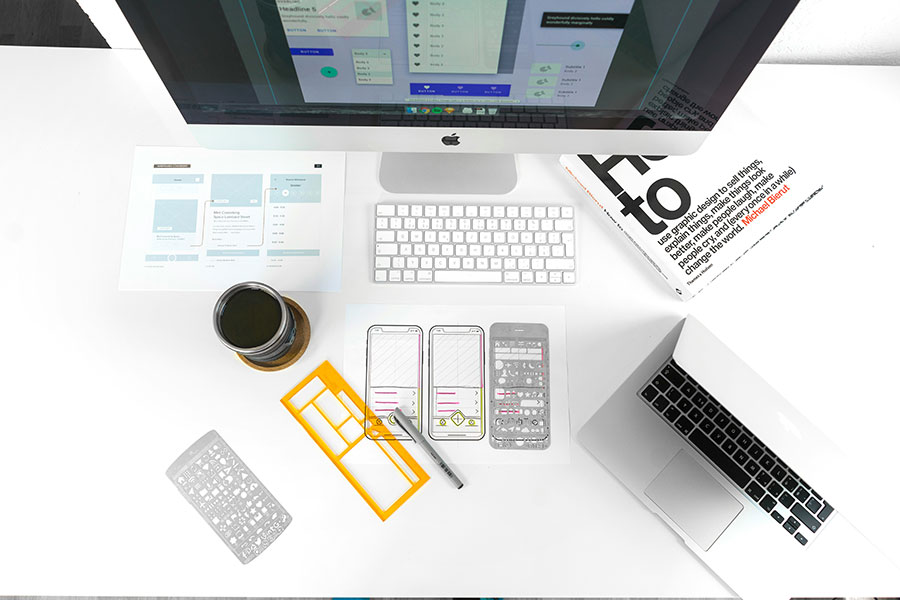
When you are creating a website, it is crucial to take into consideration how it will look and function on different devices. Responsive Web Design (RWD) and Adaptive Web Design (AWD) are two common approaches to achieve this goal.
In this article, we will examine the differences between RWD and AWD and offer insights to help you choose the most appropriate approach for your website. Whether you prefer a website that can effortlessly adapt to any device or one that provides a personalised experience, it is essential to understand the intricacies between RWD and AWD to design a site that effectively engages with your audience.
Responsive Design: How to Create a Seamless UX
Responsive design is a cornerstone approach in modern web development that empowers websites to provide an optimal customer experience across various devices and screen sizes. By leveraging the browser’s width as a dynamic variable, developers create fluid designs that effortlessly conform to any viewport.
The paramount advantage of responsive design is that it ensures consistency and usability across diverse devices, providing users with layouts and content tailored precisely to their screen dimensions. This reduces the need for separate desktop and mobile versions of a website, thereby saving time and resources for both developers and users.
Responsive design takes into consideration the vast array of devices available today, ranging from smartphones of different sizes to tablets and desktops with varying screen dimensions. By using percentage-based CSS rules for style adjustments based on device size, responsive design ensures that page elements scale dynamically for optimal viewing, regardless of the screen’s specifics.
Ingredients for responsive mobile design
Creating a responsive mobile design requires combining technical skills and creative problem-solving. Here are the ingredients you need to consider when designing a responsive mobile website:
With these ingredients, you can craft a responsive design that effortlessly captivates users across all devices.

Adaptive Design: Redefining User-Centered Experience
Adaptive design is an innovative approach to web design that creates customised website layouts for each device’s screen. By providing tailored experiences for each user, this approach ensures an excellent and optimised user experience across all devices.
One of the primary advantages of adaptive design is its ability to adjust to diverse screen sizes. This personalised approach allows websites to deliver an optimal appearance and functionality that aligns with the unique features of each device. As a result, designers can leverage the unique attributes of each device to enhance the user experience.
However, practical considerations must be taken into account when implementing adaptive design. Creating multiple layouts for every possible screen size could be time-consuming and ineffective. To overcome this challenge, designers can use user analytics to identify the most common screen sizes among visitors. By focusing on the most prevalent devices, designers can maximise efficiency while providing a customised user experience that aligns with user behaviors and preferences.
Thus, adaptive design is a contemporary approach to web design that can enhance the UX by tailoring website layouts to each device’s screen. By leveraging user analytics and focusing on the most common devices, designers can optimise efficiency while ensuring a personalised experience for visitors.
Adaptive design strategies and techniques
Adaptive design utilises various strategies and techniques to provide personalised web experiences.
- It utilises device detection techniques to identify the type of device used and then applies the appropriate layout and design elements. This allows for a customised customer experience that is excellent for each specific device.
- Flexible grid systems are also used in adaptive design to create layouts that quickly adapt to different screen sizes. This allows for rearranging content and elements, ensuring they fit and display correctly on various devices.
- Adaptive design incorporates fluid images that scale and adjust based on the screen size. This prevents images from appearing too small or too large on different devices, ensuring a visually appealing experience for users.
Adaptive design employs various strategies and techniques to deliver a customised and optimised user experience across different devices. It considers screen size, resolution, device type, touch interactions, and performance optimisation to ensure that products (e.g., websites) are accessible and functional.
Responsive vs. Adaptive: Comparison
Comparing the design strategies of responsive and adaptive web development yields distinct considerations. It is essential to find the best approach when you think out the interface of your future solution (e.g., you will design a social media website).

Responsive or Adaptive: Essential Considerations for Decision-Making
You can apply responsive design to putting your product idea to life when you have the following:
Time and budget constraints
Responsive design streamlines development, requiring only one version of the website to be created and maintained. This reduces the time and costs associated with development compared to adaptive design.
Simplified design requirements
A responsive design strategy best suits websites with straightforward layouts and functionalities. If your website’s design is clean and simple, responsive design is a suitable choice as it doesn’t necessitate intricate customisation for different devices.
Maintenance and update efficiency
Responsive design simplifies the maintenance and update process by eliminating the need to manage multiple website versions. With only one version to maintain, updates can be applied more efficiently, ensuring consistency across all devices.
Adaptive design will be suitable for your project with the following conditions:
Diverse device preferences
Adaptive design caters to audiences with varied device preferences. By creating multiple layouts tailored to different device categories, adaptive design ensures that each user receives an optimised experience, regardless of the device they use.
Resource availability
Unlike responsive design, adaptive design requires creating and maintaining multiple versions of the website, each optimised for specific device categories. While this approach demands more time, resources, and ongoing maintenance, it allows for greater customisation and optimisation for each device type.
It’s important to remember that neither approach holds inherent superiority; the choice depends on aligning with project goals, resources, and audience needs. Prioritising a well-considered development process ensures success and user satisfaction.
Wrapping Up
The decision between responsive and adaptive design hinges on several key factors. Responsive design offers a streamlined development process, ideal for projects with strict deadlines and budget constraints. In contrast, adaptive design caters to diverse device preferences, providing tailored experiences for specific device categories. Ultimately, the choice depends on project objectives, resource availability, and audience requirements. By carefully weighing these considerations, you can select the approach that best suits your needs, delivering a rewarding user experience across all devices.
But if you need to know more than the basics described, you can apply to a skilled software development company. The experienced UI/UX designers will comprehensively consult you and prepare an easy-to-use design for your product to attract your future customers.
Author bio
Yuliya Melnik is a technical writer at Cleveroad, a web and mobile application development company in Ukraine. She is passionate about innovative technologies that make the world a better place and loves creating content that evokes vivid emotions.


