
People Today Crave Simplicity and Structure
The world seems overwhelming in some ways, so the last thing you want to do with your website design is add to the noise and clutter of your customers’ lives.
The average person spends 155 minutes a day on their mobile device and 37 minutes on a desktop computer. One notable change in the last year was an increase in the amount of internet time consumers spend on their mobile devices, increasing by eight minutes in the past 12 months.
Humans feel overwhelmed with all the ads, spam, distractions and worries. One way to reduce these aggravations and keep their focus on your page’s objective is through minimalistic design. Cut the clutter and the distractions and get right to the point. You’ll gain loyal fans and reduce your bounce rate considerably.
What Is Minimalism Design?
Minimalism is a century-old concept of few elements, neutral colours and clear focus. Think of it as the fastest way to cut the clutter and create rapid loading pages for users. The goal is to use the smallest range of materials possible to get your point across.
Achieving the look may sound simple but requires intense focus. Here are the top six ways to embrace a minimalistic designed website.
1. Focus on Usability
Before you decide what to include in your design, start with the way users engage with your site. Create a wireframe of the site, listing out the functions of each page. Make sure each one is essential to your purpose for the page.
You may need a call to action (CTA) button on each page, but you probably don’t need a calculator app everywhere. Think about what you can push into the navigational hierarchy and what should remain front and centre on each page.
Make sure you consider mobile users and how different functions appear to them. How will they interact with buttons and forms on each section of your site?

Syracuse puts the focus on their autonomous crane system with an illustration of the setup. Note how the navigation bar has four options. The headline is four words. Even the CTA is short and to the point. The designer streamlined every element on the page toward the objective of sharing information on their technology.
2. Cut Clutter
For websites already existing, you can make them much more user-friendly by getting rid of elements you no longer need. Start with heatmaps. What sections of your site are your visitors engaging with? If you find things they rarely click on or hover over, decide if those elements truly match the purpose of your site.
Be ruthless. Cut extra images, extraneous words and keep what points the user to the next phase of the buyer’s journey.
3. Show Off Your Best
Part of minimalism is showcasing only the very best you have to offer. Since there isn’t as much to look at, you want users to see only your top choices. If you run an e-commerce store, you should highlight top quality or best sellers. If you serve other businesses, share testimonials and case studies of some of your successes.
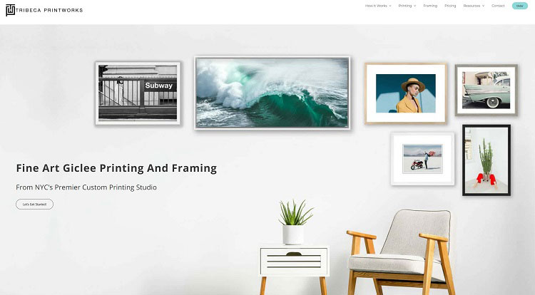
Tribeca Printworks creates a setting showing what their framed artwork can do for a wall. They don’t fill every available spot, leaving plenty of negative space and room between images. Their headline and CTA are short and to the point. There isn’t anything additional to distract the user from the purpose of getting started on their display.
4. Have an Objective
What is the purpose of each page of your website? You may have different landing pages targeted at various segments of your audience. The goals for each page might be distinct.
Know what the objective is of each page. Who is most likely to land there, and how can you best meet their needs and solve their problems? Understand your user and what drives them to seek your business model in the first place.
Once you know the reason behind each location, it’s much easier to keep only those things matching the primary purpose.
5. Check for White Space
Minimalism embraces plenty of negative space. Since you’re going for an uncluttered look and placing the focus on one primary objective, you’ll want to leave lots of room between items to ensure you aren’t just filling up the emptiness.
If your page doesn’t have as much white space as text and pictures, you probably need to cut a few things still.

Vestone Capital has just as much, if not more, negative space as text. Note how they use their logo as part of their background, turning it into a stylistic design that still maintains white space. The user’s gaze naturally shifts to the left, where the headline and CTA scream for attention.
6. Choose the Right Colour Palette
In minimalism, artists keep colour choices to a minimum. You might have one or two primary colours and then use neutral colours such as black, white and tan to flesh out the rest of the design.
Every little part of the design remains basic and uncluttered, right down to how many fonts you use and how many hues you select.
Think about some of the more prominent companies you know of. They likely use one or two colours in their design. When someone sees golden arches, they immediately think of McDonald’s. They might use only the logo and some white and black on the page, but users will still get a sense of who they are.
Make sure you choose the correct combination, even if you need to conduct some testing and research to get to the proper selection.
Study Other Minimalist Designs
One of the best ways of learning how to create a simple design is by studying others. Pay attention to the sites you visit. Are they free of clutter? What is the user experience like? How can you repeat their efforts in your designs?
Author Bio
Eleanor Hecks is editor-in-chief at Designerly Magazine. Eleanor was the creative director and occasional blog writer at a prominent digital marketing agency before becoming her own boss in 2018. She lives in Philadelphia with her husband and dog, Bear.