TLDR: Believe it or not, social media plays a big factor in how users interact with your website. There are thousands of articles explaining the basics of good web design, but the underlying idea behind these design tips and tricks is the need to enhance user experience.
Sometimes, web designers may make the mistake of sacrificing overall user experience for seemingly innovative, never-before-seen visual design elements to stand out from the crowd. While there is definitely a place for experimenting with visual design, trendy or not, users still have expectations when going to a website either through a desktop or laptop computer or through their mobile phones. One big reason? Social media.
Whether you like it or not, the prevalence of social media, and the associated boom in mobile-first design due to more accessible mobile devices, has significantly affected the way users expect a website to look and function. This is because users going online now have a new set of mental models different from users browsing the internet ten, twenty years ago.
What are mental models?
Mental models describe how someone expects something to work. It doesn’t necessarily mean that this expectation is rooted in fact, but rather users develop these mental models from exposure to previous experiences with digital products. This exposure builds their beliefs and expectations around using a product—and in this case, it affects how they interact with digital content.
Here’s an example to illustrate. A person used to apps on a phone running on the iOS system will have a difficult time adjusting to their first Android-powered phone. Why? It’s because both operating systems have different design conventions. The “back” button may be positioned differently on an Android phone than on an iOS phone, or apps may opt to position their menus on different sides depending on what kind of iOS the user is running their program on.
Where does social media come in?
Social media sites have made certain design conventions commonplace. Because an overwhelming majority of people worldwide regularly access these channels, and even more so using mobile devices, their expectations of an online experience have inevitably been coloured by what they experience on social media.
Information Density
Social media sites face the challenge of keeping their websites or mobile apps functional, addictive, and easy to navigate. They do this through the careful consideration of the information density on their interface. In order to get users to keep on scrolling, these three techniques are not only used on social media but are applied to website UX.
First, a simple yet visual interface. Social media has trained users to be visual-first with eye-popping images to delight the senses. This is done through the use of high-quality images and a distinct colour palette.
Second, keep your elements meaningfully organized so that your users can easily digest information. Huge chunks of content can easily overwhelm users. Avoid this by utilizing white space to evenly distribute content and highlight important parts of your page.
Third, make sure the text on your page plays with visual hierarchy. This means that if you have a headline, use an appropriate size and thickness to make it stand out. For call-to-action buttons, use a box or a different color to get users to notice it.
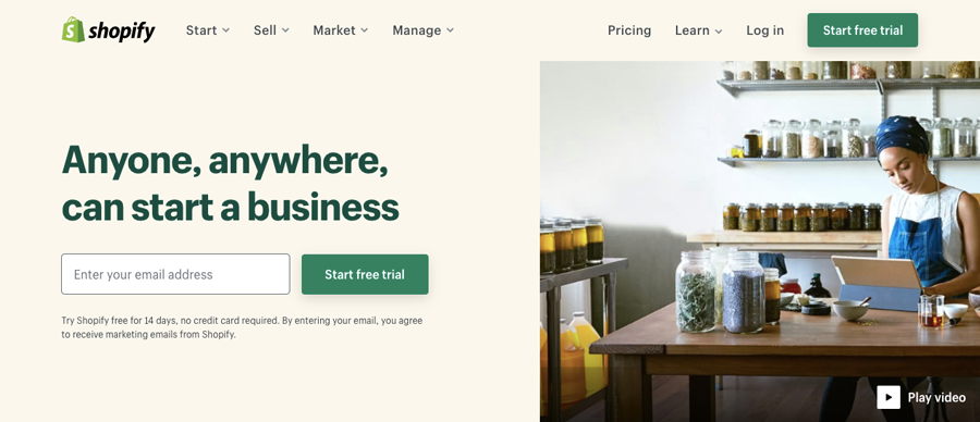 Image credit: https://www.shopify.com/
E-commerce giant Shopify’s website is a great example of a clear yet visually-captivating page. Shopify, which has more than half a million active users, uses two clear colours — beige and forest green —to complement their logo. The banner image clearly demonstrates what services they offer, while the main headline is highlighted in a contrasting colour to emphasize its importance. To urge website visitors to take action, the CTA button is large and clearly visible.
Loading Time
Social media has trained users to expect pages to load fast. Tweets and posts are engineered to load immediately with a swipe of a finger to retain users on social media platforms. The expectation of fast loading times is now the same for websites.
Kissmetrics ran a study to understand how loading times affect customer retention and have discovered these crucial insights:
- 40% of consumers abandon a website when it takes more than 3 seconds to load
- A 1-second delay leads to a decrease in customer satisfaction by 16%
- 52% of shoppers said that quick page loading is important to their site loyalty
Ebay is an example of a site that increased loading times to improve conversions. With a dedicated team, they removed unnecessary bytes in their code, optimized images for each platform, and used predictive tools to deliver the right content to the user. With these cuts, they discovered that a 0.1-second decrease in load time resulted in a 0.5% increase in conversions.
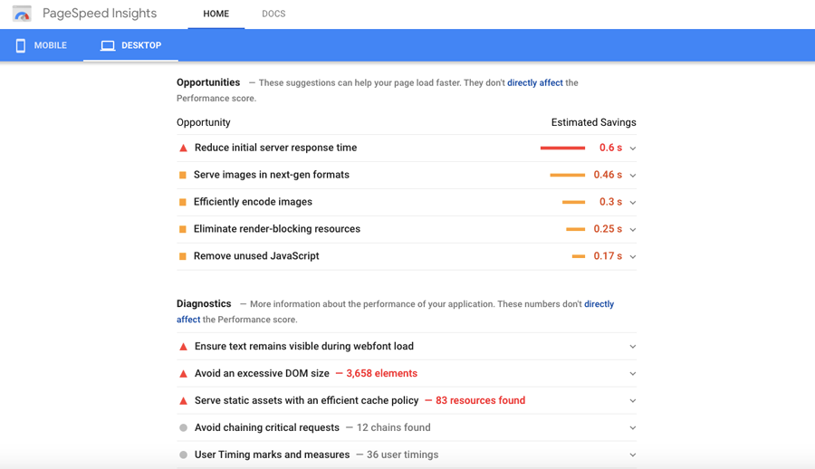
While Ebay has a dedicated team to do performance improvements, you can use tools like Google Page Speed Insights. These tools can provide you with your mobile and desktop’s page speed as well as suggest actions you can take to improve your loading time.
Mobile-Responsiveness
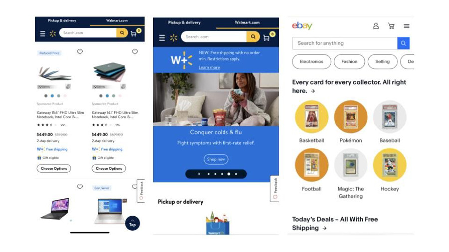
There are more than 3.5 billion social media users in 2020 and according to market research firm We Are Social, 99% of global social media users access these platforms via mobile. This comes to no surprise as social media apps are optimised for mobile. As a result, social media ads primarily lead users to a mobile site. A great example of a website optimized for mobile-responsiveness is Walmart.
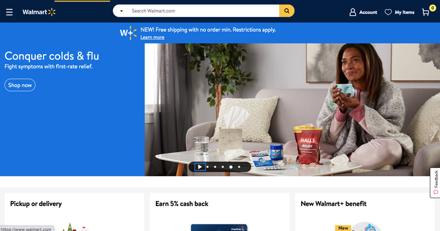 Image credit: https://www.walmart.com/
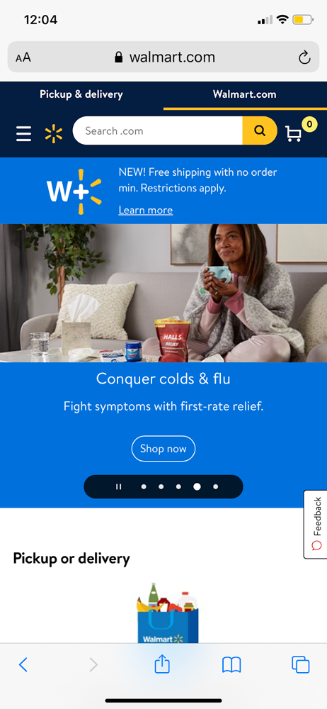
Walmart discovered that they get sizable traffic from tablets and mobile devices. With this in mind, they aimed to create a touch-centric experience for their mobile site. To compare, when accessed on web with a laptop or desktop, the Walmart website features a slew of different products, which fit perfectly on screen. On mobile, you’ll notice that the site’s design responds to the orientation of your device with banners adjusting to the size of your screen.
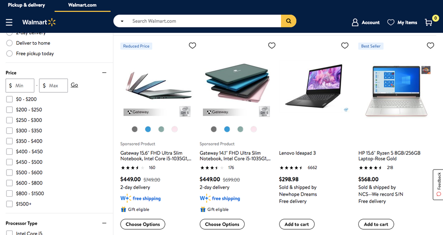
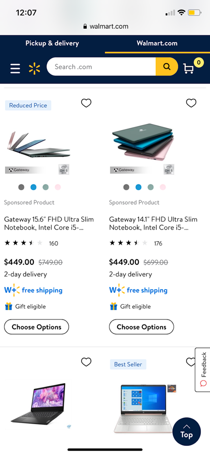
Another important step was to optimize the product pages. In addition to having presentable photos, spacing comes into play where instead of featuring four items in a row, they focused on the UX of the device and featured only two items per row for their mobile site. This ensures that customers can get a better view of the products.
These changes led to a 20% increase in conversion rate and a 98% increase in mobile sales.
Conclusion
Building a fast, user-friendly, and mobile-responsive website based on the principles of social media is key to getting users to enjoy the experience they have on your page and potentially become customers. We’ve outlined the different tactics you can utilize to improve your website. However, it’s important to always do your research, test, and maybe even attend an online course. Before making abrupt changes, test incremental changes on your website and see what works, this is also something to consider before starting a business.


Leave A Comment