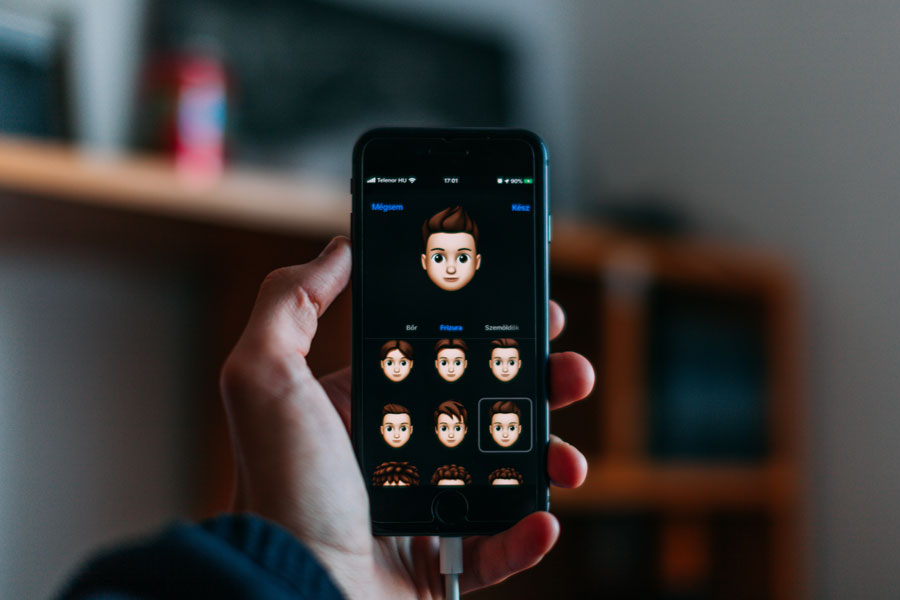
Dark Mode is Currently a Huge Design Trend
In mobile app development these days one of the biggest design trends among world-class names like Google, Facebook, Apple, Instagram, and WhatsApp is dark mode. What is a dark mode? Dark mode is a low-light UI or User Interface that makes use of dark colour, black or grey usually—as the main central background colour. It’s a reverse of the default white, which has been used for decades by designers.
As a response to the increased screen time, app developers have discovered that dark theme interfaces help minimize eye strain, particularly during night-time or in low light instances. And of course, less eye strain means fewer headaches and a better work experience.
Recently, the dark mode theme has been launched on a lot of popular applications, and on your smartphone’s optional theme as well. It’s safe to say that dark mode is here to stay. Why use dark mode? Let’s find out.
The Pros of the Dark Mode Theme
1. Well-being and Health
Think about being in a dark room and a white screen is blinding you. You get painful and dry eyes from looking at bright blue screens throughout the day. A lot of people use their mobiles throughout the day and even at night, thus it comes as no surprise that a lot of people are suffering from eye strain.
Bright screens could cause digital eye strain. Dark mode with light text on a dark background is better to reduce eye strain in conditions with low light.
2. Saves on Battery
Dark mode design helps prolong the battery life. It’s been confirmed by Google that the dark mode on OLED screens has been a game-changer for the battery life of any mobile device. The dark interface, at 100 percent screen brightness saves a staggering 60 percent of screen energy.
Although OLED screens are used mainly by Android devices, there has been some good news for iPhone users lately. Apple promised to drop all LCD screens this year and deliver all their future devices with OLED screens.
3. Amazing Look
These days, when you ask a mobile app development company like eTatvaoft to build an app for your brand, one of the things that would likely be discussed is the theme of your mobile app, and thus dark mode has become a key option. Honestly speaking, dark mode simply looks amazing. While most products for the same white bland look, the dark mode offers something different, which feels new, mysterious, and intriguing.
Moreover, it provides great opportunities to present graphic content, like dashboards, graphs, photos, and pictures. It seems that colours just pop up better on dark backgrounds. Also, the colour of items on an interface could entirely change how we interact with the content as well.
The dark mode boosts user retention, and using it makes it an interesting opportunity for mobile app development service providers today.
Designing Dark Theme for Android
Google has a comprehensive documentation support, which helps mobile app designers understand how a dark theme operates on Android. The tech giant has established principles, which defines the dark User Interface design, and provides a starting point on designing dark mode.
1. Colour with Accents
With a dark theme user interface, use limited colour accents so that most of the space is dedicated to dark surfaces.
2. Dark with Grey
Use grey colour when designing a dark theme, instead of using solid black to show elevation and space in a space with a wide range of depth.
3. Conserve Energy
When designing products that require efficiency with dark mode, like those devices with OLED screens, save battery life by minimising the light pixels usage.
4. Boost Accessibility
Accommodate regular users of dark them, like those with low vision, by meeting colour contrast standards accessibility. In Google Material Design Guidelines for a dark colour scheme, they have fixed various properties and overall mode, such as:
Elevation
In the dark theme design process, components retain the same default shadow components as well as elevation levels such as in the case of the light theme. What varies is the surface elevation levels’ illumination. The higher a surface is, the lighter the surface would be.
The lightness is showcased via a semi-transparent overlay application. Furthermore, overly differentiating between components and seeing the shadows possible.
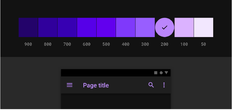
Contrast and Accessibility
In a dark theme UI, the background has to be dark enough to show white text. The contrast should be a minimum of 15:81 between the text and the background. This ensures that the body text will pass the WCAG’s AA 4.5:5:1 standard when added to the highest elevation surfaces.
Colours
For a dark theme user interface, saturated colours should be avoided to reduce eye strain. Rather, app designers should focus on unsaturated colours since they boost legibility. The choice of primary and secondary colours should depend on the consideration of light and dark UI themes as well.
a. Dark backgrounds, light text
A light text on a dark background should use opacity levels, such as:
- A 87 percent opacity for high-emphasis text
- Hint text and medium-emphasis with 60 percent opacities
- Opacity of 38 percent for disabled text
b. States
Communicates the interactive elements for dark theme components or layout status by making use of overlays. State in a dark theme should use the same overlay values as the light default theme. A couple of containers inherit the state overlays, namely, Surface and Primary. Surface uses the Surface colour to be applied on the overlay, which matches the colour of an icon or text. For containers using Primary, the state overly should be white.
Designing Dark Theme for iOS
Apple has revisited the meaning of UI colours and styling in iOS with the dark mode theme. The following are changes that Apple has made to help in designing dark mode for iOS 13.
1. Semantic Colours
To standardise the look and feel of iPhone apps in dark and light mode, Apple came up with semantic colours for the UI elements that are applied commonly. The colours have no absolute RGB value, they adapt to the iOS interface style directly. Moreover, they have introduced semantic colours to handle the text and overlay colour in the dark mode theme.
2. Blur and Vibrancy Effects
With iOS version 13, Apple introduced eight vibrancy effects and four blur effects that adapt to the iPhone interface style automatically. The following are the blur effects in the light and dark mode.
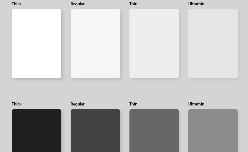
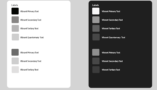
Moreover, Apple has introduced four vibrancy effects in a dark mode typography suite, one for separator and three in overlay. These are the following:
3. System Colours
Aside from semantic colours, Apple also came up with nine predefined system colours. They are dynamic and support the dark system-wide appearance, meaning that the colours adapt to the chosen interface styles, such as the semantic colours.
4. SF Symbols
In their Human Interface Guidelines, Apple offers a collection of over 1500 symbols for designers and developers to use in their apps. Automatically, they look wonderful in the dark mode theme since they have been optimized for both dark and light user interface.
Conclusion
Google states that dark mode could boost visibility to users with low vision as well as those who are sensitive to bright lights. Apple on the other hand says that the dark mode makes it easier for you to stay focused on your work. Microsoft states that it could reduce eye strain and boost the battery life. The marketing message is that people want dark mode.
Thus, developers are scrambling to offer dark versions of apps, and people are getting excited when an app such as Slack offers a dark mode theme. Indeed, dark mode has become a trend that’s rapidly escalating. The choice to use it or otherwise depends on your usability and requirements.


Leave A Comment