First impressions matter
While your competitors are spending a lot of time and money on improving their websites, a limited budget and short time frame shouldn’t keep you from doing the same for at least your landing pages.
First impressions matter a lot if you’re running an ecommerce website, and for many of your potential customers, your landing page is often their first encounter with your business. Your ads and marketing material have drawn them to your landing page; now, your landing page should keep them wanting to know more.
If you’re pressed for time and have just 12 hours to improve your landing pages, try one of the following approaches.
Work on your headline and value proposition
The headline is one of the first things a person sees when they visit your site. It’s also possible it’s the only thing they read on your site. On the average, 8 out of 10 people leave the page after reading the headline.
If there’s one thing that gets your visitors to stay, it’s a headline that compels the visitor to keep reading. Here are tips you could use for your next headline:
- Keep it clear and simple. People will always choose easy-to-read copy over something that’s trying to hard-sell.
- Give your visitor a solution. People who visit your page come there in search of an answer to something that bugs them.
- Be consistent. Write a headline that actually matches what the rest of the landing page is saying.
- Ask for a response. Start your headline with a question, like “Want to Bump Up Your Sales?”
- Use Title Case. Using capital letters in the right places will emphasise your headline’s importance.
- Use “selling” words. These include secret, free, new, guaranteed, quick, and results.
- Don’t be afraid of sounding sensational. Try something like “Discover the Quick Weight Loss Secret That Has Men Around the World Talking!”
- Start your headline with a joke. We only recommend this if you’re actually funny.
- Make it sound instructional. Start your headline with “How To”. Do this only if you’re writing a how-to article.
Whatever you write, make sure you’re upfront about what you’re offering. At the same time, reveal just enough to make your reader want to know more.
Your headline should also appeal to human emotions, which is something the Emotional Marketing Value Headline Analyser is able to test. If you have different versions of a headline, you can use the tool to determine which one would work best. The Headline Analyser looks for words commonly considered emotional and calculates their frequency in your headlines.
Most successful copywriters include up to 40% emotional marketing value (EMV) words in their headlines. If your headline has a low score, you can include more EMV words or shorten your headline altogether to increase your EMV score.

I tested some headlines I saw in different landing pages using the EMVHA, and here are the results:
- Make up to $33/hour Driving Your Car (Lyft): 28.57%
- Learn to code interactively, for free (Codecademy): 33.33%
- Get Great Whiskey Every Month and Learn About It (Taster’s Club): 33.33%
Now, when I tested our example earlier, “Discover the Quick Weight Loss Secret That Has Men Around the World Talking!”, it got a low score:
You have to remember that EMV scores alone won’t determine the success of your headline. You have to run two or more tests on your headline to get a combination that works. It should reflect your brand’s unique selling proposition and address your customers’ pain points.
Change up your CTA button’s appearance
Ever wondered why the likes of Apple and Amazon use buttons with rounded corners in their product pages? While you think design elements are purely aesthetic, their use is actually rooted in something deeper.
Before we discuss the science behind rounded buttons, here’s why you should care about how your buttons appear: you want people to click them. And for site visitors to click on a button, it should stand out from the rest of the landing page.
Colour plays a large role in making the button stand out. Using a colour that contrasts strongly with the background will draw site visitors’ eyes to the button. Use a colour wheel (shown below) to identify the colour that contrasts with your website background or text.

Source: Wikimedia
To use the colour wheel, find your site’s dominant colour, then find the colour directly across it. If your site has a blue background, use yellow to make your buttons stand out.
There are some colours that are almost universally recognised when it comes to landing page buttons. Red, for one, creates a sense of urgency in the user, while orange is energetic and is strongly associated with sales.
Size is also a consideration for landing page buttons. A good landing page creator should let you create buttons in different sizes. Of course, big buttons will stand out more. Just don’t let them take up too much space or steal the scene from the text. If you want to keep the button a certain size, you should at least surround it with enough white space to stand out.
Finally, shape matters when it comes to creating buttons for your landing page. Studies show that sharp-cornered buttons have lower conversion rates than ones that have rounded corners. It’s mostly psychological. Our brains perceive anything with sharp corners as a threat, and buttons are not an exception.

In addition, sharp corners tend to direct attention away from the call-to-action inside the button. Rounded corners, on the other hand, tend to “enclose” your eyes within the space they occupy and “force” you to read what’s inside, making your CTAs more noticeable. The “Buy” button on the Apple Store, for instance, has rounded corners, making you focus on the text inside.
A properly-designed CTA button can help increase your conversions quickly so you get more leads or people on your email list. You can then use an email verification service to check that the information provided is valid.
Give your lead capture form a do-over
Many studies show that people tend to give up on forms when they see there are too many fields to fill out. Lead capture forms, in particular, are significant drivers for landing page bounce rates.
This happens because you are more inclined to skip a form when it sees there are too many blanks to be filled. If you do start filling it out, you are likely to abandon it halfway through.
To avoid this problem, you need to reduce the number of fields, either by asking for less information or by combining fields. For example, unless you really need to sort your data by users’ last names, there is absolutely no reason for you to ask for visitors’ first and last names separately. Just ask them for their name and get it over with.
Do you really need their home, work, and mobile phone numbers? Unless you are actually doing business with the site visitor, I can’t see any reason you should ask for one contact number. You can always get additional information later, when the customer is further down the sales funnel.
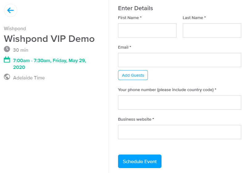
The screenshot above shows how little data is actually needed to schedule a live demo for a software — your name, email address, business website URL, and phone number. The date and time were set in a prior step that didn’t involve filling out fields. I also like how there was an option to add guests, using a pop-up, that doesn’t make this particular form look unwieldy and crowded.
But what if you really need a boatload of data and cannot reduce the number of fields? Breaking up your lead capture form might help. People are more inclined to fill up a series of short forms than just one long megaform that might need multiple scroll downs to navigate. If you decide to take this route, adding a progress bar will help visitors visually track how long they still have to go in the process. It’s a lot better than looking at rows and rows of blank fields.
Add trust badges and guarantees
If your online business doesn’t proudly display its trust badges, you’re missing a lot of sales opportunities.
Customers are more picky about the websites they transact with nowadays, and your website’s trustworthiness is one of the most important things they’ll consider before clicking on “Buy Now” or “Check Out”. Adding a trust badge to your landing page could help increase your conversion rate, especially if you’re running a small business.
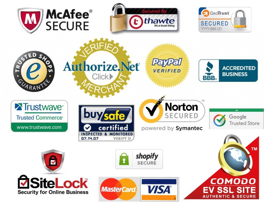
However, people trust some trust badges more than others. A 2016 study done by ConversionXL found that the most familiar issuers of trust badges — Mastercard and Visa, PayPal, Norton, Google, and the Better Business Bureau (BBB) — were also most trusted by customers. Google has discontinued the issuance of the Google Trusted Store badge, so the sixth-placed badge in the study — McAfee — is also worth considering in 2020.
While trust badges can help increase your conversions, it’s not as easy as grabbing a logo from Google Images and putting it on your landing pages. You actually have to earn those badges and each issuer has their own procedure.
The end result is worth the effort: 94% of shoppers are likely to complete the purchase when they see a Norton Secured Seal in checkout, with similar percentages for the others in the top five badges.
Badges are not the only thing you can add to your landing pages to drive up conversion rates.
You can also offer guarantees. Here are some guarantees you can add:
- 100% Satisfaction Guarantee
- 100% Money Back Guarantee
- Lowest Price Guarantee
- 100% Risk Free Guarantee
Remember, you can only add these guarantees if you are able to keep your end of the agreement. Otherwise, you risk losing trust and money when a customer is not satisfied with your product.
Get endorsements and testimonials from previous clients
Trust badges work because they serve as proof that your business does things the right way and keeps things secure. Endorsements and testimonials, on the other hand, are proof that your customers are happy with what you give them.
However, generic reviews do more harm than good to your business. Take a look at the following:
“Excellent product.” – Dennis P.
“Great service!” – Anna B.
“Good job! More, please.” – Ria V.
None of them describe their experience with the business. We aren’t even sure if they are real people in the first place. Prospective customers want to read real narratives written by people whose existence can be verified.
A comprehensive review, written by a real person, will give your visitors the assurance they need. Consider the example below:
“My BS meter tingles right away whenever I hear the phrase “no hidden charges”. I’ve had bad experiences in the past that make me suspicious about those claims. But my experience with Stark Industries is a lot different. In just a few months, my label has turned from a money sink into something that actually generates some profit.” — Lincoln Parks, CEO of Emotionally Invested Records, Inc.
The example above tells a story, gives a result, and lets us know who is doing the review and why we should care about their opinion. If your business gets a testimonial like this, you can feature it prominently on your landing page to generate conversions.
If you don’t have any testimonials, though, don’t get someone to just write random reviews. People have their ways of detecting falsehood. Most customers would be happy to write a testimonial if their experience with your business was positive, so don’t be shy to ask them for one.
Apply quick fixes to your landing page and see immediate results
While building an ecommerce website is not an overnight process, there are quick fixes you can apply to your landing page to improve your conversion rate. These could be as simple as changing your headline and CTA button shape, or as complicated as trying to reduce the number of fields in your lead capture form.
While these are relatively easy changes, it’s best to try them one at a time to identify what works best. Otherwise, you won’t be able to pinpoint which approach works for your landing page. The key to successful landing pages is continuous testing which sometimes takes months. But the reward, in the form of higher conversion rates, is worth all the effort of changing and testing.
Author Bio
Owen Baker is a content marketer for Voila Norbert, an online email verification tool. He has spent most of the last decade working online for a range of marketing companies. When he’s not busy writing, you can find him in the kitchen mastering new dishes.




Leave A Comment