
As a web designer, it’s tempting to embrace new trends, especially the ones that seem brilliant at first glance. However, styles change as fast as the direction of the wind. What seems like a great idea today may irritate users tomorrow.
There are about 4.57 billion active internet users, with the United States ranking in the top three for number of citizens online. Making a website that speaks to a small segment of that audience requires knowing the preferences of your users and testing your site frequently to see how visitors respond to changes.
Even though some web design trends are likely here to stay, others come and go rapidly. How can you know which ones to pay attention to? What are some good reasons to stick with classic design and ignore what’s popular in the moment?
4 Reasons You Shouldn’t Always Pay Attention to Trends
If you followed after every web design trend, your site would look like a crazy mish-mash of elements. It’s important to know why you shouldn’t always pay attention to trends.
1. You Could Harm the UX of Your Site
If you follow design trends and make frequent changes to your site, you may irritate your customers and harm the user experience (UX). Put yourself in the shoes of your average site visitor.
Your buyer has your site bookmarked because they want to make a purchase. They go back to the page only to find it looks completely different than it did before. The design may be aesthetically pleasing, but if it isn’t intuitive and the user can’t easily add the item to a cart and checkout, you’ve lost them.
2. Your Site Might Run Slow
Adding in some scripts that help users sync up their smart speakers for search or other add-ons sounds like a good idea in theory. However, they can also bog down your site and make it load slowly.
In a study by Pingdom, experts found the average load time for web pages is 3.21 seconds. However, two seconds was the mark where bounce rates started to increase dramatically. For your site to meet or exceed benchmarks, you must limit scripts, compress images and invest in the best website hosting you can afford.
3. Your Audience Might Feel You Don’t Understand Them
When creating websites, your top consideration should be your buyer personas. You must know your audience and know them well. Understand what their pain points are and realize your site is supposed to offer a solution to their problem.
When you only focus on adding in modern design trends, you may miss the opportunity to create a usable interface for the site. It’s far more important that the user feels comfortable with the look and layout of your pages than for them to think what a trendy design you have. The only people who care about trends are typically designers and artistic types.
Know your audience and what their main concern might be. If it is a shopping cart that works efficiently, then look for things that speed up and improve the usability of e-commerce stores.
4. Your Focus Will Always Be on Appearance
When you run after trends, your attention will always be on how your site looks and if you are using the colors of the year or adding in elements other designers use. While a beautiful design matters, it is far less important than some of the other elements of design.
The best way to use trends in your design is by looking at what makes sense to your users. Keep what works and get rid of what doesn’t. Don’t be afraid to try new things and conduct some split testing to see how users respond. However, also be willing to keep what is already functioning well for your audience.
Trends You Should Incorporate Into Web Designs
While there are reasons to avoid chasing after trends, there are some ideas that stand the test of time. Let’s look at a few elements you should consider adding to your next project.
1. Use Icons
One thing we’ve seen for several years now is the use of icons to help define different categories. Adding images enhances any text labels, but it also makes it easier for the user to scroll through your site and get a feel for the different things you offer. Icons present a clean, uncluttered look that works well both on desktop and mobile devices.
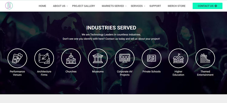
Illuminated Integration features icons to show some of the industries it has worked with in the past. As you scroll through, you see symbols for educational institutions, museums, churches and performance venues. Under each icon is matching text in case the emblem isn’t clear.
2. Tap Into Augmented Reality
Augmented reality (AR) takes something real and adds an element of virtual to it. There are many examples of companies using this technique in recent years. IKEA is known for offering an app where you can use your smartphone camera to see how furniture will look in your home
AR is something likely to grow in coming years, so adding the option to your site, particularly if you’re in retail, gives users the ability to picture the item in their possession. It is very likely to increase overall conversion rates.
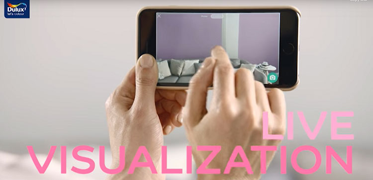
Dulux offers an online visualizer so customers can see how a paint color looks on their walls before they invest time and money into a new shade. It offers the app for both iOS and Android devices.
3. Get Mobile-Friendly
In recent years, designers have embraced elements such as responsive images and dark mode. These features adapt well to a mobile environment. With over half of people now accessing the internet via their mobile devices, making sure your site is responsive is a necessity.
Pay attention to how your fonts resize on smaller screens. Make sure images scale down and don’t drop off the page. Is all your text readable? Does the navigation bar shrink and become more friendly to mobile users?
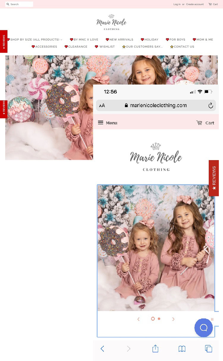
Marie Nicole Clothing has a similar look between the desktop and mobile versions of its site. The mobile version has a condensed menu and two rows of products across rather than four. However, when compared side-by-side, you can see it has the same look and features. The site just adapts for smaller screens.
March to Your Own Drum
Know who your customers are and what they prefer in design trends. If there is something that seems to work well for your clients’ needs, then give it a try. Otherwise, focus on creating a usable site that meets consumers’ needs and provides flexibility for any changing technology.
Author Bio
Eleanor Hecks is editor-in-chief at Designerly Magazine. Eleanor was the creative director and occasional blog writer at a prominent digital marketing agency before becoming her own boss in 2018. She lives in Philadelphia with her husband and dog, Bear.

Leave A Comment