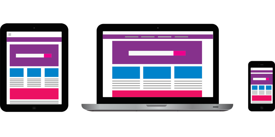
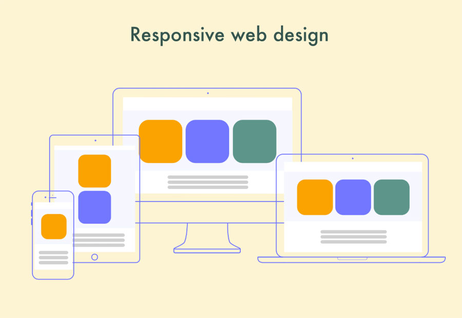
To display your content properly, you should develop a responsive design
Today, websites and mobile apps are the leading means of attracting customers to the product. While mobile applications are expensive in development and may not suit small companies, sites are a must-have for every business.
However, while developing a website, you should remember that users are surfing the Internet via different devices. Some use mobile phones, while others use desktops. To display your content properly, you should develop a responsive design for each type of screen.
In this post, I will guide you through the process of responsive design development.
Responsive design or mobile app?
Even if you own a responsive website, you should consider developing a mobile app. The most important thing is to determine whether the application can attract more users, or it will become a waste of resources.
Let’s overview the cases when you need a mobile app or a website.
When to build the mobile app
It is better to build a mobile app in the following cases:
- Special opportunities. Do you intend to provide some special services that require mobile phones? Build an app with no hesitation. For example, augmented reality features need a camera to function. Besides, your app icon will remind users about your product.
- Offline access. If you want your users to access your services without an internet connection, the application is your choice. Unlike websites, apps can display the content in offline mode.
- The mobile app is supplementary. Applications shouldn’t strictly copy the website. While websites can describe your product, applications should have some additional features that will bring more value to users. There is no sense of creating an app that will display the same information as a website.
On top of that, applications handle large amounts of data better than websites. For example, if you develop an app for calculations, users of a mobile website version might not get a decent experience.
When to develop a responsive web design
Why bother with responsive web design? As I mentioned, the app should be an addition to your website. If you have nothing specific to implement in the app, then responsive web design is what you need.
Now, I’m going to highlight some of the use cases of responsive websites:
- Brand promotion. If you intend to create a massive application like Telegram or Uber, but you’re only at the beginning, you should promote your app. That’s where the website comes into the business. A responsive website will be an excellent opportunity for users to learn about your product. Later, if everything goes well, you’ll build a standalone mobile application. Some of the most popular applications, for example, Instagram and Pericope, have web versions, but their main target is to let more people know about the app.
- Specific content. Due to the content, some websites don’t need a mobile app. It’s useless to create a mobile app filled with food recipes or for a small news website.
Points to keep in mind while building a website
Before getting to the process of responsive website development, I will cover some pitfalls developers should watch out when they create a web design.
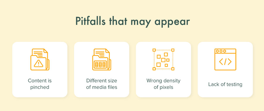
- Content positioning. At this point, developers have to understand what would be convenient for users while they interact with a mobile version of the website. What elements should be on the screen and how the design will look on different size screens, for example, tablets.
- Size of media files. Website optimisation is the key point to the best user experience. If a web site is loading too long, it’s more likely that the user will close the tab. One of the components of optimisation is the file loading process. If the size of the media file is too big, the website will load slowly. So, bear in mind to find an acceptable solution to this problem.
- A density of pixels. While building a responsive design, you shouldn’t forget about the desktop version. So, make sure that content looks perfect on both small and large screens. That’s an issue that may be confusing to a novice developer.
- Testing. Finally, this one is crucial for every software development. To avoid the failures with content displaying or feature performance, you should conduct tests on various devices. There are a lot of desktop emulators that imitate different mobile devices.
Essential steps you should take to create an outstanding responsive design
Eventually, we’ve reached the main section of this post. It’s time to talk about the main steps for creating an efficient and catchy responsive design.
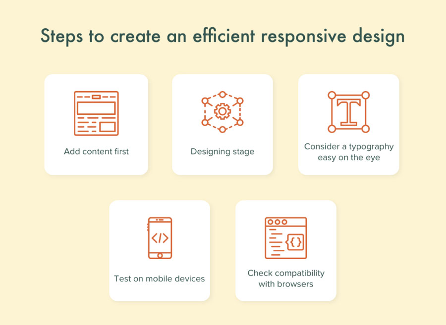
Step 1. Content is above all
Typically, web developers create a page, and only then writers fill the page with content. This approach can result in some inaccuracies in displaying content. To avoid this mistake, you should follow this design pattern:
- A content manager creates a filling for the website;
- Designer creates images and logos;
- Then the designer draws sketches of a website layout and shows how he sees text, buttons, and images;
- Designers present the plan to developers for consideration;
- After all the questions are settled, start designing your website!
This pattern will bring benefits to the final result.
Step 2. Design
The next step is to create mock-ups considering suggestions made at the previous stage. Designers can use different templates provided by graphic editors or design websites manually. It depends on the order and demands of the customer.
Step 3. Don’t give up on typography
No matter how good UI/UX design of a website is, it won’t succeed when fonts are as ugly as sin.
Throughout the workflow, designers use special tools that analyse the typography. These tools are meant to help in the development of appropriate fonts and matching the style of the font to the overall style of the website.
Step 4. Don’t forget to check responsiveness
As the designing stage is held on a desktop computer, we can see how our website looks on a computer screen. However, if you’re building a responsive design, you should constantly verify how your website looks on mobile screens. Having checked your website on both smartphones and tablets, you’ll be able to avoid some mistakes and bugs in the release version.
Step 5. Compatibility with browsers
The difference in browsers, as well as in phone screens, can affect the displaying of contents. That’s why make sure to test the design on every popular browser.
Development stage
After all the steps above, it’s time to proceed to the development of your website. Mockups should include a layout, text, and images. In order to build a high-quality product designer and front-end developer should be in touch throughout the whole development process. That’s how they’ll be able to solve important issues and not to miss something critical.
Wrapping up
Responsive web design is part and parcel of modern websites. If handled the right way, your website will look amazing and deliver the content that will be suitable for every device. The only thing to remember is to hire a dedicated team of developers.
Author’s bio
Vitaly Kuprenko is a technical writer at Cleveroad. It’s a mobile app development company company in Ukraine. He enjoys telling about tech innovations and digital ways to boost businesses.


Leave A Comment