Web designers need to understand the fundamental science behind colour theory. It is a popular topic with a vast amount of information to retain and digest. It is a topic that includes both art and science.
Given the vastness of this subject, we’ll be glossing over some critical points and extracting what exactly should be emphasised. Each of these topics consists of examples that pertain to colour schemes and combinations. Expanding further knowledge on such a rich subject will mobilise your creativity for future projects.
It’s important to understand that the better you do your web design work, the happier your customers will be. Many professional web design agencies and self-employed web designers neglect colour theory. They go with the flow and hope for the best. Such an attitude and approach can be seen as unprofessional today, so if you are still unaware of basic colour theory notions and principles, then it is time to make a change.
colour affects not only the appearance of a website but also its effectiveness. It means that the average time spent on site, the number of returned visitors, and even conversion depend on the colour scheme’s choice. Moreover, taking into account modern technologies’ visualisation, colour plays a crucial role on the Internet. Don’t forget this rule when starting your website.
But some of us can barely pick a matching outfit. It’s therefore not always clear how to choose the right colour scheme for your website. But don’t give up! The theory of colour can help.
Once you’ve studied its basics, you will be able to create beautiful, useful colour combinations. All experienced web designers rely on theory, which means learning it is not out of your reach. Let’s talk about its main principles, and you will quickly see everything is much easier than it seems.
Colour Theory Basics
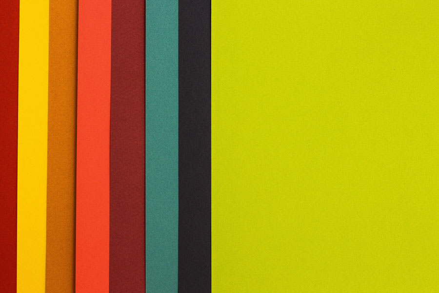
When venturing into the world of colours, it’s useful to start in square one. There are genuinely only three primary colours – red, blue, and yellow. They are the root ingredients from which all other colours are made.
These are known as secondary colours and always contain a mix of 2 primary colours. These three secondary colours are orange, violet, and green.
This colour scheme is based on the sample default style. When you start designing for web and print, you may need to switch between different colour models. These include RGB and CMYK, which are notoriously utilised in digital and print design, respectively.
Choosing a Colour Scheme
Every website has a colour scheme – the primary colours it uses for its main areas. As we’ve been discussing, the repeated use of these colours will affect the user’s mind and mood, typically subconsciously, so choose them well.
While there are many different ways to mix colours, we’re going to focus on the three most successful and common ones.
Triadic Scheme
The triadic is the most basic and balanced of the three structures. Using vibrancy and complementation, the triadic structure is the safest and most reliable scheme. On the 12-step colour wheel, select any three colours located 120 degrees from each other: one colour for the background, and two for content and navigation.
Compound or Split Complementary Scheme
The next scheme gets a little trickier to pull off, but can be rewarding if done well. The concept uses four colours: two contrasting pairs and two complementary pairs.
Analogous Scheme
Lastly, there is the analogous scheme, which focuses exclusively on complementary colours. This one highlights the vibrancy of the colours chosen; for example, a red-orange-yellow analogous scheme will seem energetic and lively. While this scheme is relatively easy to pull off, the trick is in deciding which vibrancy of colour to use.
Blues, turquoises, and greens can create a subdued and even safe atmosphere for a website you design. Consider using contrasting colours to draw attention to calls-to-action.
These are just the fundamentals of how colour theory can boost your UI design. But there’s no limit to how in-depth you can go with colours on your site.
Tools for Working with colour
Luckily, there are plenty of tools to help you put colour theory into practice. The pre-made colour palettes provided below will help you avoid starting from scratch and have a foundation for further work.
- Adobe Colour CC – Previously known as Kuler, this is one of the most trusted colour assistance tools available;
- Flat UI Colour Picker – While for flat UI designs only, this is still a useful and convenient tool for colour selection;
- Paletton – If you need a tool for speed or a simplified ease-of-use, this minimal tool can help you. Great for beginners.
There are plenty of pre-made colour palettes on the web. So, take your time and find other examples if you don’t like the ones provided above.
Conclusion
All in all, understanding how to use colour properly will help you become a better web design specialist. colours are all around us. People are used to seeing a wide range of colour combinations,
Except for those who are colour-blind. Most people associate colours and their combinations with particular things. You may even cause excitement or disgust with the colours you use in web design.
While there are contrasting and complementing shades and hues, you always want to apply the best dimensions of colour theory you can. In this cutthroat market environment, colour theory is one of the surest ways to stay competitive and relevant.


Leave A Comment